COLOR WOVEN WILD
Soul Evolution Brand
+ Website Design
Leigh Oviatt
Date: Jan. 2025

Contemporary & Historical Influences
Weaving Wellness Through Design: Color Woven Wild
I designed and created a comprehensive brand identity for Santa Fe-based fiber artist Leigh Oviatt, whose intuitive approach transforms traditional weaving into bold contemporary art that brings healing energy to spaces and the humans that live in them.
The visual system pairs geometric modernist forms with vibrant colors drawn from Mexican and Guatemalan cultural influences.
Through thoughtful typography, a modular identity system, and the evocative tagline "Color Woven Wild," the brand captures both the textural richness of her fiber art and her innovative approach to textile art.

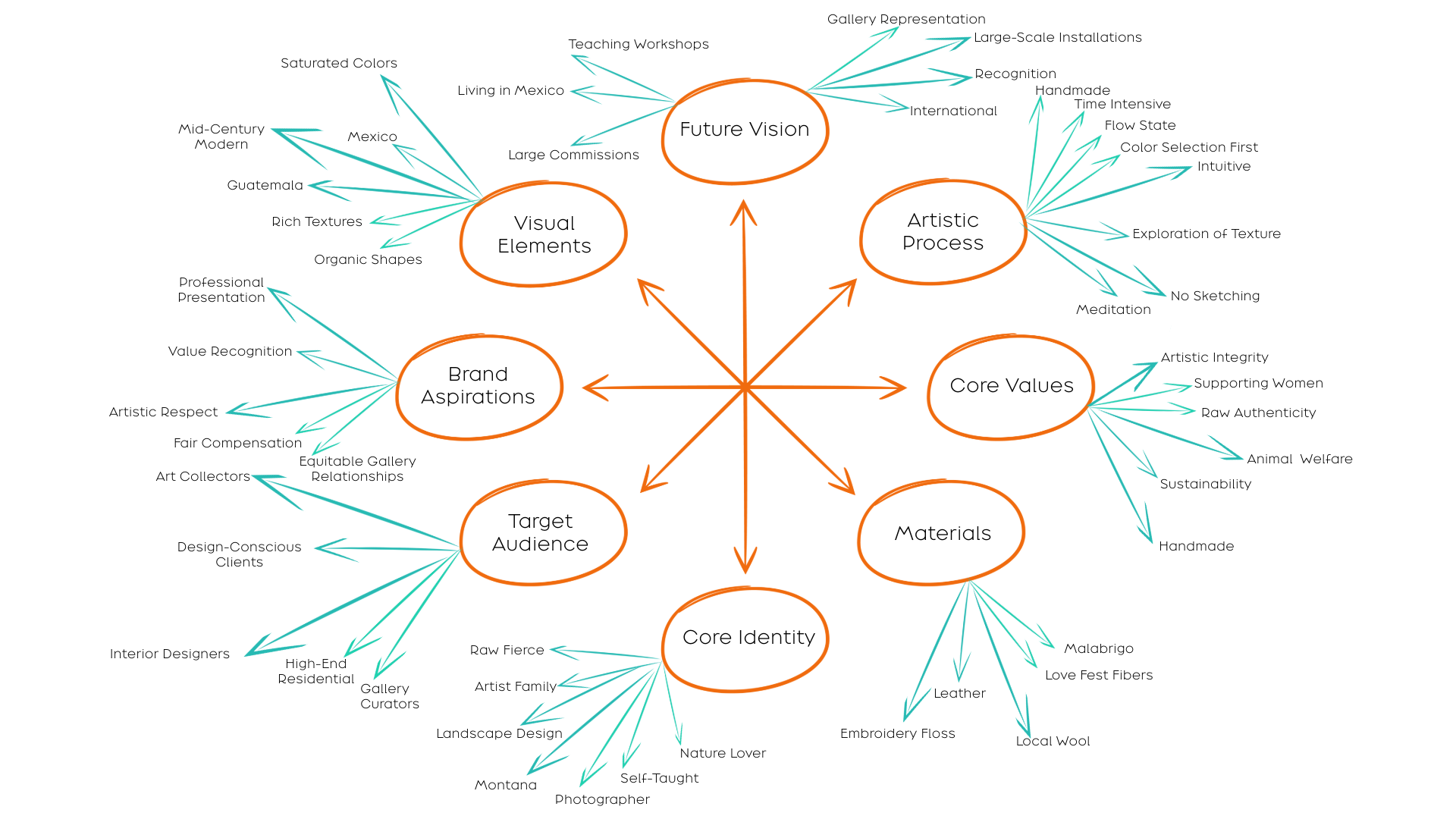
Brand Discovery & Key Themes
During our discovery process, 3 powerful themes emerged that would shape Leigh's visual identity:
Color Story &
Cultural Heritage
The brand palette flows from three sources: Leigh's vibrant street photography, her richly textured fiber art, and the colorful streets of Mexico and Guatemala—creating a dynamic spectrum from saturated corals to turquoise blues."
Transformation
Through Art
Like raw fibers spun into stunning yarns, Leigh's journey from Montana ranch life to Santa Fe fiber artist informed a brand that celebrates both roots and evolution.
Mindful Creation
Leigh's commitment to ethical sourcing and women-owned businesses inspired a brand system balancing intention with intuition. Her thoughtful approach to materials and process reflects in every design choice, honoring both tradition and innovation.
Visual Development
Type Explorations
Typography development began with exploring letterforms that would capture both the geometric precision and organic flow of Leigh's work.
Logotype Development
The logotype evolution balances modernist structure with artistic fluidity, incorporating a circular element inspired by both lunar phases and wholeness—suggesting transformation and continuous movement.
The final design (below) reflects Leigh's journey from traditional craft to contemporary expression.
“I effing love this so much. THANK YOU, thank you, thank you!🤩” —Leigh Oviatt
Tagline & Secondary Typeface
Through our mindful discovery process, 'Color Woven Wild' emerged as a natural expression of Leigh’s essence.
The tagline weaves together her artistic inspiration, craft, and spirit—reflecting both her work and my approach to brand design, where every element is thoughtfully chosen to tell an authentic story.
The selected secondary typeface for 'Color Woven Wild' mirrors the organic texture of Leigh's fiber art.
Its handcrafted strokes and varying line weights echo the natural variations found in her woven pieces—where each thread creates both structure and spontaneity.
Like her work, the letterforms balance precision with flow, their brush-like quality capturing the same meditative rhythm present in her weaving process.
“Cheryl’s design work has taken my business to the next level.” —Leigh Oviatt
Color Palette Development
Drawing directly from Leigh's fiber art and travel photography, I captured a vibrant spectrum that tells her unique story.
The palette flows naturally from turquoise blues inspired by Mexican architecture, through warm oranges echoing desert sunsets, to deep corals reflecting her textile work.
Complementary sage greens and neutral grays ground the system, creating a balance that's both bold and sophisticated.
Monogram Development
The monogram for Leigh Oviatt's brand identity explores the harmonious intersection of the 'L' and 'O,' creating circular compositions that evolve and separate—reflecting her nonconformist approach to fiber art.
Clean architectural lines meet softer curves, while vertical elements suggest weaving's warp threads.
The design celebrates her style through bold colors and geometric forms, bridging mid-century modern aesthetics with vibrant Latin American influences.
Brand Applications
The visual identity flows naturally across digital and print touchpoints, creating an intentional ecosystem that nurtures connection between Leigh, her collectors, and her greater community.
LeighOviatt.com
Leigh’s immersive website and mindfully designed collateral work in harmony to create spaces—both digital and physical—where art meets healing, and beauty serves a deeper purpose.
Business Card
The square format business card breaks from tradition, creating a distinct canvas where Leigh's modernist logotype and vibrant brand colors meet clean white space. This balanced composition reflects the harmonious blend of structure and fluidity found in her fiber art.
Postcard
Each art purchase is accompanied by a personalized postcard that extends the brand's visual language into an intimate touchpoint. These thoughtful pieces allow Leigh to share handwritten notes of gratitude, deepening the connection between artist and collector.
Tote Bag Design
The brand's iconic monogram and tagline extend naturally onto organic cotton totes, creating an artful, everyday touchpoint that celebrates both sustainability and style in Leigh's signature orange palette
*This portfolio page highlights key elements of Leigh’s Soul Brand Identity. For a deeper look into my comprehensive Soul Brand Identity process, which includes extensive discovery, strategy, and brand story development, please visit my offerings page.
“Cheryl's thoughtful and intuitive approach made bringing my vision to life a joyful collaboration.” —Leigh Oviatt
Mindful Brand Development
Transform your healing mission into an authentic brand presence that deeply resonates with those seeking your unique gifts. Our journey unfolds mindfully, honoring both intuition and intention.


