Intention,
Movement,
Medicine
Soul Evolution Brand
Sensory Website Design
Studio L’HEAL
Date: Jan. 2025
Contemporary
Influences
Intention, Movement, Medicine: Studio L’HEAL
Studio L'HEAL is a holistic wellness sanctuary in Toronto's vibrant Little India neighborhood, where somatic healer Leah Tellez creates personalized healing experiences that blend somatic movement, energy work, and intuitive guidance.
The brand identity needed to reflect both structure and flow—mirroring Leah's approach of learning traditional practices to mindfully transcend them.
My exciting challenge was to design a cohesive visual identity that honors multiple cultural influences while translating healing as coming home to yourself—balancing the grounded, structured elements of Leah's practice with her flowing, intuitive approach.
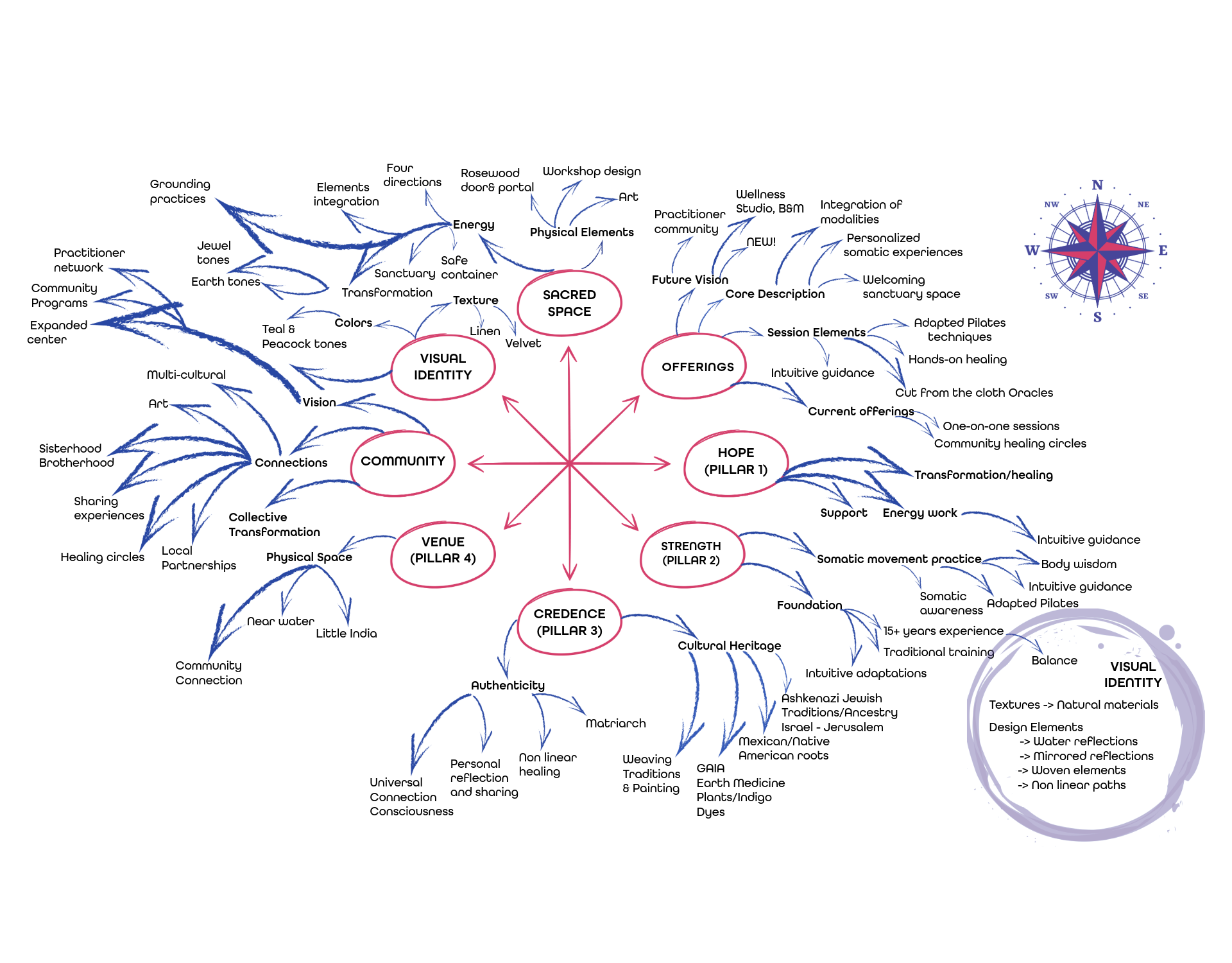
Brand Discovery & Key Themes
During our discovery process, 3 powerful themes emerged that would shape Studio L’HEAL’s visual identity:
Color Story & Heritage
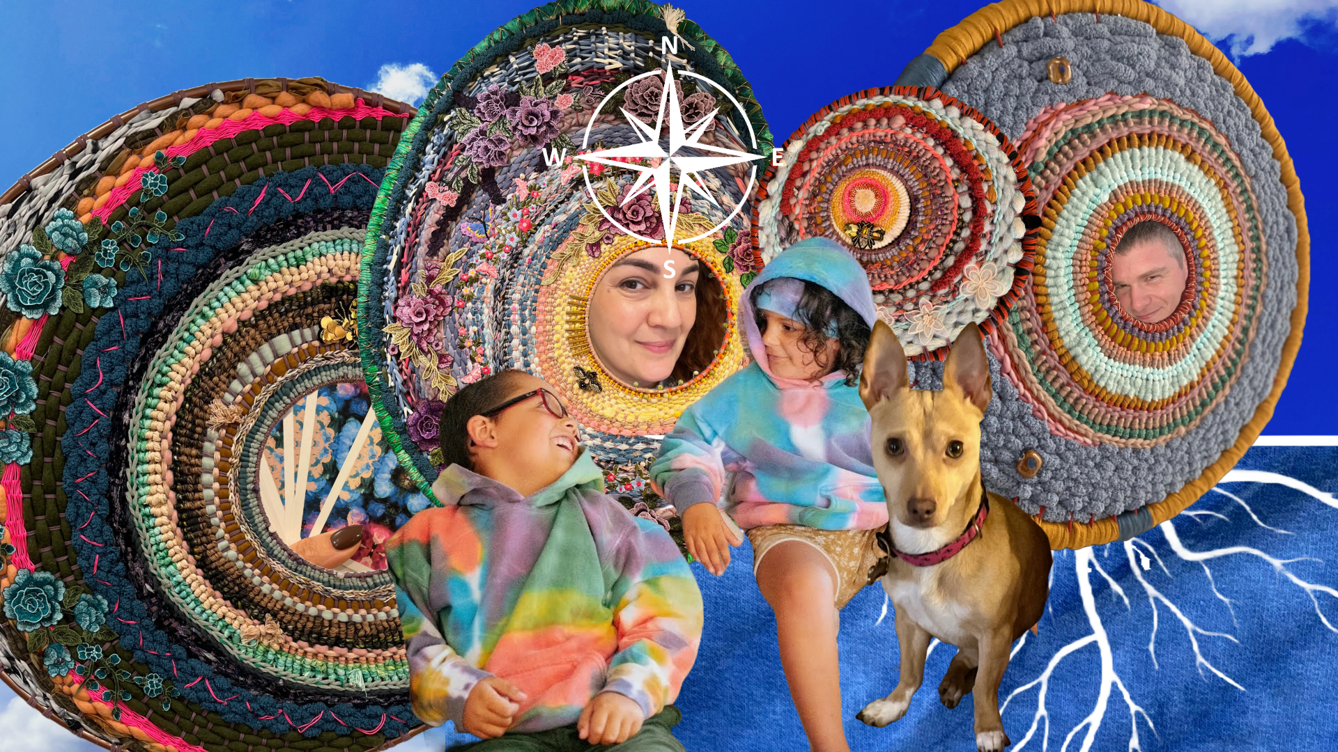
The brand palette draws from Leah's multicultural background and Little India's vibrant neighborhood. Rich jewel tones honor her Mexican and Jewish roots while creating a welcoming space that feels both grounded and expansive—from earthy browns to peacock teals.
Structure & Flow
Leah's approach centers on four core pillars: hope, strength, credence, and venue. These pillars provided the structural foundation for the brand while allowing for the flowing, intuitive elements that make her practice unique—like learning traditional techniques to mindfully transcend them.
Healing Through Connection
The visual system reflects Leah's commitment to creating sanctuary where transformation unfolds naturally. Circle motifs represent the cyclical nature of healing, while the monogram's curved forms embody how she balances holding space with allowing movement—structure with freedom.
Visual Development
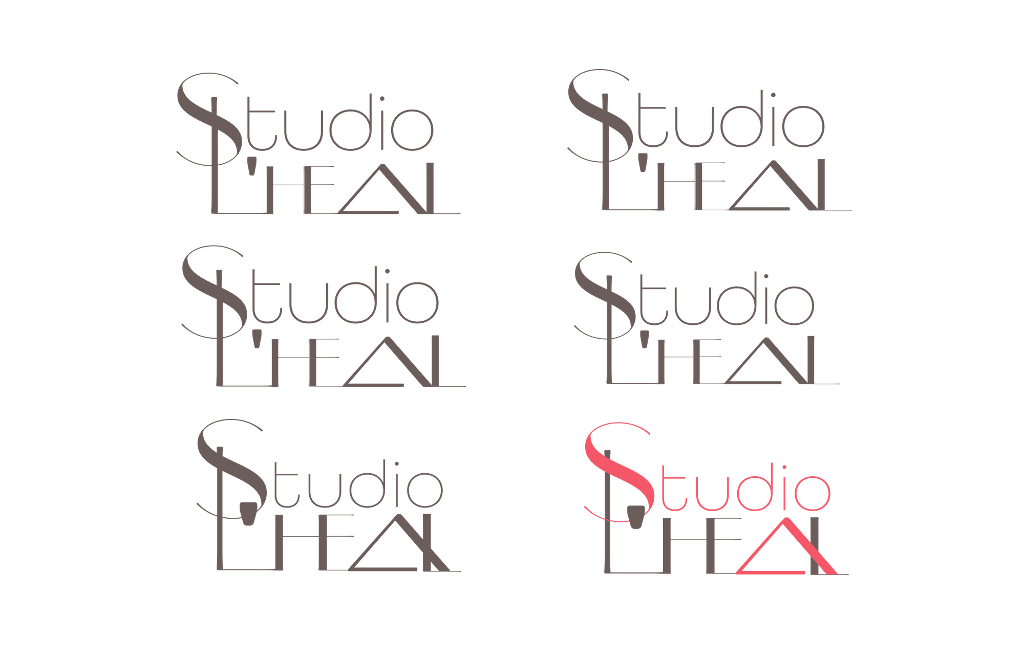
Type Explorations
The letter forms evolved through careful refinement—exploring the structural "S" variations to achieve fluid movement while maintaining stability, then balancing the vertical strength of the "L" with the protective triangle of the "A" that symbolizes Leah's grandmother's supportive presence.
Logotype Development
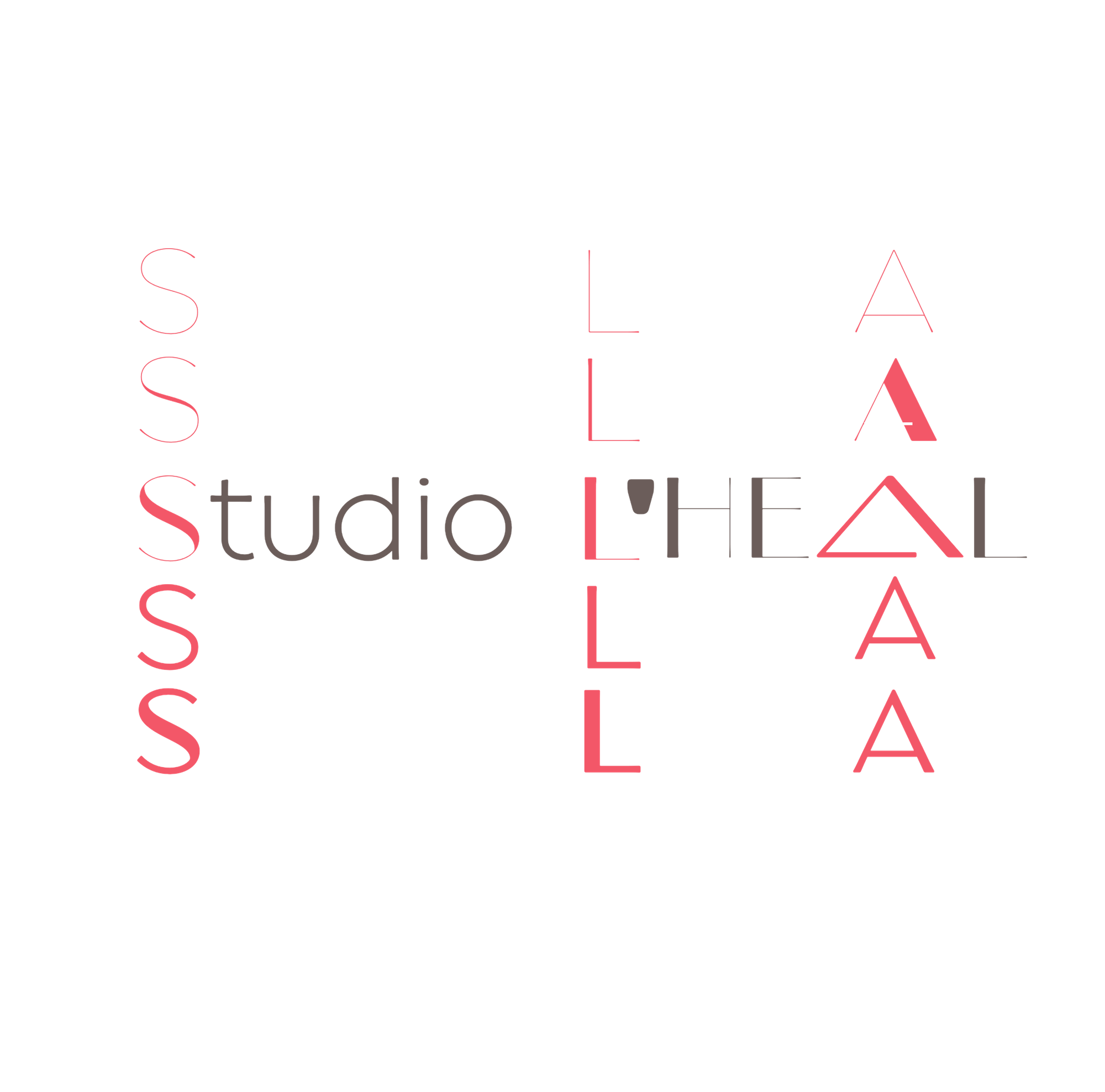
The final typographic system integrates the flowing curves of Broadacre for the "S" with All Round Gothic for "tudio," creating a harmonious contrast between the grounding vertical elements representing Leah's four pillars (hope, strength, credence, and venue) and the more fluid, intuitive aspects of her healing approach.
“She is the one! The pyramid reaching over like a hand to the L, Omggggg…” —Leigh Tellez, Owner of Studio L’HEAL
Tagline & Secondary Typeface
The tagline "Intention • Movement • Medicine" perfectly captures the essence of Leah's practice in three powerful words. Set in All Round Gothic, this typeface was selected for its organic, circular quality that complements the primary logotype while echoing the shapes in Leah's studio.
The typeface's varying weights and styles—from light to bold, regular to italic—create visual rhythm and movement, mirroring how Leah's sessions flow naturally between structure and freedom.
The circular dots between words visually reference both her practice and the cyclical nature of healing journeys.
“Cheryl has the capacity to listen and effortlessly re-create my journey through a symbol.” —Leah Tellez
Color Palette Development
The vibrant color palette for Studio L'HEAL reflects both cultural richness and healing energy, drawing from Leah's multicultural heritage and Toronto's Little India neighborhood. The system combines jewel tones with earthy neutrals—from coral pink representing vitality, to teal evoking tranquility, purple adding spiritual depth, and golden ochre bringing in earthy healing qualities.

Monogram Development
The monogram balances structure and flow with a grounding vertical line and a fluid, dance-like "S" that wraps around it—symbolizing how Leah holds space for her clients (the vertical) while allowing movement (the curve), with versatile color variations that echo Little India's vibrancy while maintaining deep presence.

Brand Applications
The visual identity flows seamlessly across digital and print touchpoints, creating a cohesive experience that resonates with clients seeking healing. From website to merchandise, each application maintains the core balance between structure and invitation.
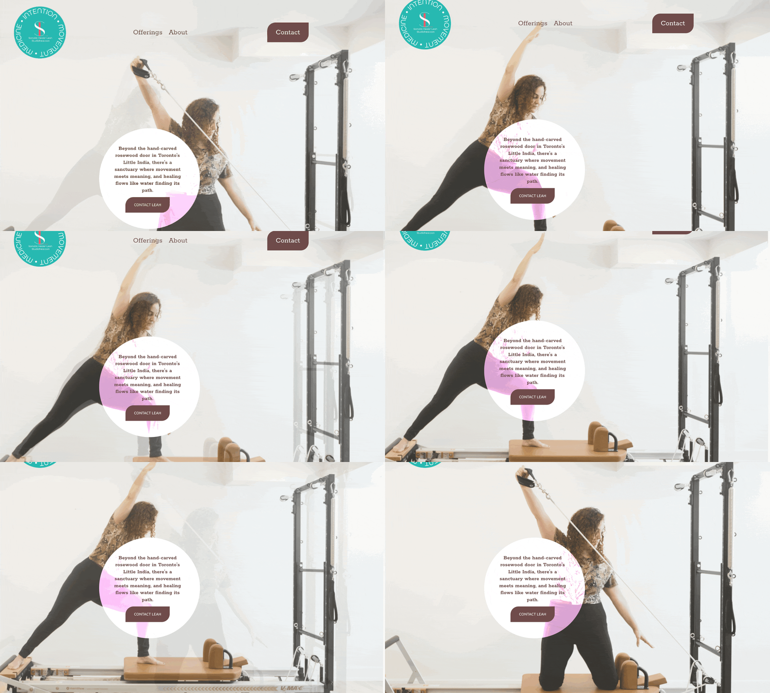
StudioLheal.com
Leah's sensory designed website seamlessly integrates the carefully designed visual and symbolic elements into a compassionate, easeful, digital space where clients can explore offerings and connect with her healing practice.
Business Cards
The coin-inspired circular format creates a distinctive touchpoint where Leah's mantra "Intention • Movement • Medicine" encircles her brand mark in vibrant color combinations. These unique cards reflect her holistic approach—each one becoming a tangible token of her healing philosophy that clients can carry with them.
Clothing
Leah's artisanal clothing line is in development, featuring hand-crafted hoodies and sweatshirts that showcase her talents beyond somatic healing. Each piece will become a wearable canvas for her weaving, painting, and tie-dying techniques—extending her artistic vision while building community through shared aesthetic experiences.
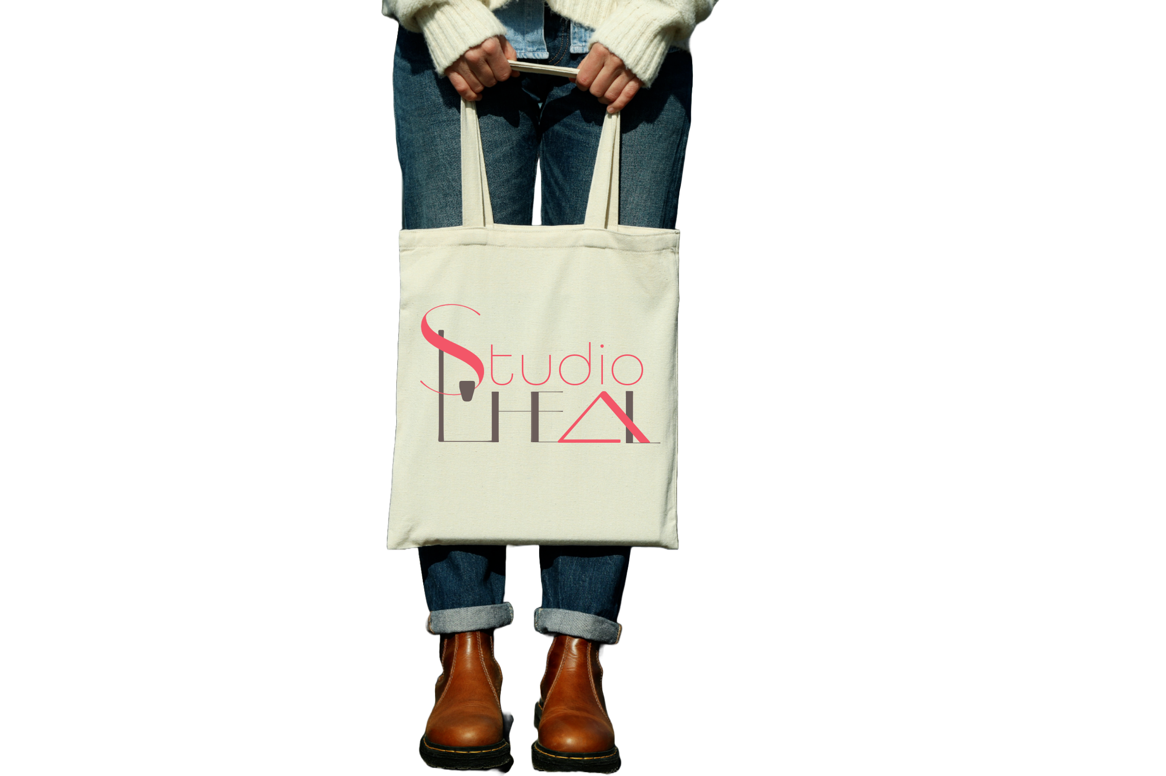
Tote Bag Design
The brand's logotype extends naturally onto organic cotton totes, creating an artful, everyday touchpoint that celebrates both sustainability and style in Leah's signature vibrant palette.
*This portfolio page highlights key elements of Leah’s Soul Brand Identity, Studio L’HEAL and her website. For a deeper look into my comprehensive Soul Brand Identity process, which includes extensive discovery, strategy, and brand story development, please visit my offerings page.
"I feel completely confident in Cheryl's abilities—anyone working with her will feel the same." —Leah Tellez, Owner of Studio L’HEAL
Mindful Brand Development
Transform your healing mission into an authentic brand presence that deeply resonates with those seeking your unique gifts. Our journey unfolds mindfully, honoring both intuition and intention.


